Some time ago I posted an article about DokuWiki, I don’t remember what it was. The site was new. It’s still new, it’s perpetually new since I barely do anything to it so articles are more like placeholders to evaluate what is the look I want, I needed to some image for that post.
I may be still finding my ways and I’m aware that I will make mistakes like a beautiful young geisha who got railed by a soccer team and broke character in the moment, that’s fine. But like the geisha, I have something very well semented cemented: I want as little color as possible other than in accents, and maybe a soccer team. So for like the fourth time this week, I created another logo.

UPDATE
Since the original, the design has been updated for a third time. This post has been mostly rewritten to reflect that.
After the first version, I bet you cannot guess what came next. You better sit down for this…
Ready?…
The second version! Wow!, I know, right?!
“Can’t innovate, my ass!”
Phil Schiller
What are those lines inside the letters, I hear no one ask?
DokuWiki’s original, official, logo is a little too busy for me. I has too much color yet not enough. What I mean is that it’s a faded old-librarian-looking sort of color palette, which I guess in a way is fitting for the kind of web app it is.
But why though? There’s no need to evoke the old paper look, we do things on screens now. Recently there was an effort to save Ukraine’s digital history because of its invasion and even the big giant library, Wikipedia, got a refreshed look as well. At least in the posts of my site/intranet, I’m going to try to make DokuWiki look the best I can with my non-existent developer skills.
Reading some article DokuWiki’s website I learned that the arrows of the original design are supposed to symbolize hyperlinks while the different-colored pencils mean collaborative editing.
Oddly enough I arrived to the same conclusion but for completely different reasons: see, to me having different colors on the pencils is either a way to not make the design look repetitive or could be because of the formatting (styling) of an article e.g. title, headers, code boxes, links, etc. The arrows were an indication of the pencils moving, while being two of them I thought it meant simultaneous collaborative editing.
So, yeah… kind of the same conclusion but followed a completely different path to get there.
I decided to leave that behind. I outlined the old logo because it would be a smoother transition and out of respect for the original author, I took a little inspiration from what I’ve learned from my own progress since I started designing my own stuff, there is this handwritten logo I made before. I wouldn’t do another handwritten logo though, it’d look just lazy and sloppy, but I wanted to incorporate either handwriting or some sort of cursive or long stroke text styling. “DokuWiki” is a wide word, I like elongated, very stylized things. I gravitate heavily towards minimalist design but I don’t give a f**k if it’s not true minimalism, I’m only in it for the looks not so much the practical side of it.
So if it can’t be slender and colorless, heroin chic, then go all the way in the opposite direction. Exacerbate the width, go for bold. And so I did.
So, where does the handwritten comes in?
Inside! The extra width allow to ornament the text from within so it still has a clean(-enough) silhouette. Imagine you have one of those lamps to look at x-ray film:
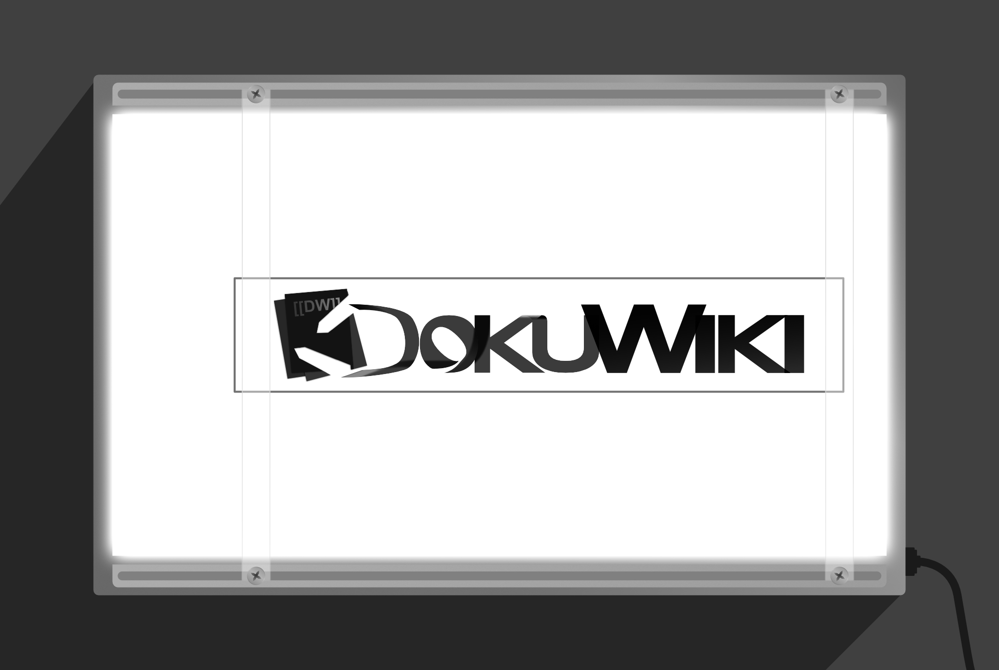
The design is still usable using only the its outline, e.g like for stationary or whatever, like I said, I’m not exactly big on print.
Then why bother?
Because somewhere I read… or heard… IDK, that logos should work in one or two colors, and because if deemed worthy, all of these logos I’ve been making for other people/brands/organizations, I intent to give the rights to them to their respective prospective owners. What good do they do just sitting there on some intranet website or single post on a single site when they can serve much better the projects’ owners? Right?
And in the case of DokuWiki, it’s1 letting me use this awesome tool for free, it’s the least I can do to give back. It’s most likely to get ignored anyway since it1 seems to be all in in the sepia theme.
- DokuWiki — the organization/project
UPDATE NÚMERO TRES
Some day in April 2023
So, the other day I was doing something totally very interesting — and I know because somebody told me “that’s totally very interesting what you are doing” when I told them to tell me — and I saw this (current) page and I didn’t like my design anymore, some of it.
On the senseirum, the place where the Jedi keep the dragon balls and where the sensei (past and current) meet in telespiritference, but most importantly where the ultimate knowledge of nothing is kept and has been fiercely guarded for millennial; the sensei relayed to me the theory that the more time you spend working on something, the more likely you are of Stockholm Syndrome yourself into liking it and I think that happened to me.
There was something off. I made a few more modifications and dialed down the effects used on the design. I replaced the most of the alpha-blending effects with their results applied directly as opaque fillings so at the time of exporting SVGs the incompatibilities were minimized. I also confident-black-womaned (or in certain markets: “dad-bodded”, “hot daddyed“) part of it to be more uniform, because part of the reason I created my own logo, was not only giving it neutral colors but also making it look a little less haphazardly put, still preserving the original author’s design a little.
Last minute, I found out that part of the incompatibilities of SVG exports were due to the color format the design had; it had originally RGB/32 (HDR) color format, after changing it to RGB/16 now it exports OK. However, even if it didn’t, the changes are done so it should have minimal issues across different devices.
I downsized the number of objects as well, for instance; in the previous designs, the whole image was backed by a white bottom of its own outline because otherwise the blending would darken or lighten pseudorandomly colors behind it, and therefore the image itself.
In the end, it came up more minimalist than I expected anyway.
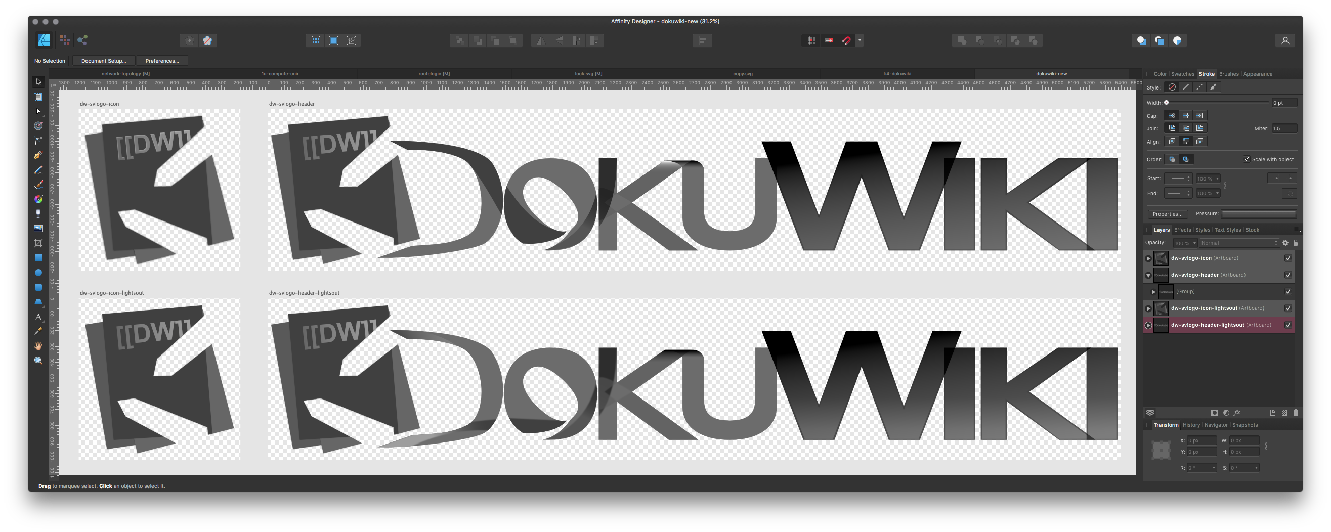
Files
In the first two versions, I exported to hi-res PNG, the original multi-artboard AFDESIGN (Serif Affinity Designer) file, SVGs, PSD, EPS, EXR and HDR. Neither SVG nor EPS exported correctly so I threw in PSD (which seems to support vector data) and HDR and EXR because they seemed fancy enough that they might be usable tor recover information to reconstruct the SVGs.
That’s no longer necessary, so there are only SVGs and PNGs this time. There’s an simple HTML file that should be easy (enough) to edit to preview the SVG files with transparency.
An finally the original AFDESIGN file which also includes the previous version and a fourth text-only version of the design which I didn’t mention earlier because it’s unfinished. I don’t think I can finish it because I’m teaching all the padawan Advanced Telekinesis and Introduction to the Dark Arts this millenial, and right on cue the anti-dark arts matter protesters won’t go away. Without zen in the gardens, the padawan can’t be taught, y’know how it is…
ls
| 107K | dokuwiki.afdesign |
| 11M | dokuwiki.zip |
| 2.9M | dw-svlogo-dw-text-only-draft.png |
| 92K | dw-svlogo-dw-text-only-draft.svg |
| 3.7M | dw-svlogo-header-lightsout.png |
| 296K | dw-svlogo-icon-lightsout.png |
| 108K | dw-svlogo-icon-lightsout.svg |
| 370K | dw-svlogo-icon.png |
| 148K | dw-svlogo-icon.svg |
| 3.4M | dw-svlogo-opaque-effects.png |
| 188K | dw-svlogo-opaque-effects.svg |
| 664B | index.html |
Meta
| Document resolution | 400 DPI |
| Artboard dimensions – squared | 1024px × 1024px |
| Artboard dimensions – banner/header-type | 5400px × 1024px |
| Color format | RGB/32 (HDR) |
| Color profile | sRGB IEC61966-2.1 (Linear) |
| Alpha channel | ✔︎ |
| Document resolution | 400 DPI |
| Artboard dimensions – squared | 1024px × 1024px |
| Artboard dimensions – banner/header-type | 5400px × 1024px |
| Color format | RGB/16 |
| Color profile | sRGB IEC61966-2.1 (Linear) |
| Alpha channel | ✔︎ |
Preview
Below in the upper artboart, in the lower artboard is the unfinished design.
Last time, there was long explanation spanning many paragraphs about design decisions/elements, why this and that. I’m summarizing that in a single annotated image. It does a quicker job and I think most can be inferred from it.
Yes, it is a single image, right click it or drag it out of the browser to save and you’ll see.

Allez ! C’est tout.
Leave a Reply