A few months back I while customizing my systems, among the list of things I could mess with was the boot manager I use on macOS (and later on the first PC I build), rEFInd.
It turns out I had to redesign all icons I needed on my own to match the look I was going for, and if I was going to do that, it just made sense to do the whole theme so anybody else could use it they wished. The whole set up process would go to waste otherwise.
Late in the project I realized I had to design an icon for rEFInd itself, with my color scheme or rather lack thereof since it’s a grayscale/silverish theme and had to convey what rEFInd does or say something about it at least a little bit more than the its official logo ’cause, picture the following scenario:
A friend of yours is helping you with stuff, you’re busy at another desk. They turn on the machine and rEFInd on an internal disk comes up, you need to tell them to load rEFInd on a flash drive but just by looking at the icons they’d have no idea which is it. The rEFInd logo says not much about it.
In this hypothetical your friend also has to be a raging moron to be incapable of figuring out arrow keys, but you get the point.
My project had already gotten out of hand at that point, not to mention that after finishing the logo for rEFInd and exporting what I thought was the finished theme, it came out horribly misaligned so I still have to correct that. With the rEFInd logo, my goals were (1.) to make it convey something about itself and (2.) being the what whole kickstarts operative systems, itself had to look kickass over all the other peasants logos it passed control over. Just kidding, some distros actually have some very cool logos.
Unlike all the OSes which have guidelines and whatnot, on this one I was starting from scratch, so I had free reign which I guess would be an artist’s dream, but I’m not an artist, or a designer for that matter, I just stumble onto this and sometimes I manage to learn how to operate them, like Serif’s Affinity Designer. All that decision making without a structure in place is terrifying to me. But I started drawing a few objects and sort of got in the zone.
I wanted to draw something like “micro”chips, the big chunky ones that were on old motherboards before they started painting them all black1 just for the fact that those are like the floppy disk equivalent on the save button; most people have never seen them but they know what they are.
*: Coincidentally something that got lost on me since I switch to macOS in the Tiger days, I had little business left on the insides of computers from that moment on, except for servers which to this day are still very green, just not environmentally.
I’ve lost count of how many people many people I’ve met who think “the Windows” is on those chips, not on the spinning where they know their data is. I don’t know how so many people manage to get to the same conclusion, but y’know, now that NVMe disks are not only mainstream, but they are mounted right in the motherboard where the rest of the chips are, those that held on being wrong got so far back that being right caught up with them poking them in the ass that they could just ride it and get to the forefront of things. I’m picturing an arrow that’s reaching it’s own tail along the perimeter of a circle, if you’ve know idea what I’m talking about. To be honest, I’ve no idea either.
Twinsies!
Where was I?… Oh yeah, chips holding code. These I think would signify both where an OS would be in addition to the EFI code. Next is how to depict that this thing I’m describing searches for things. A magnifying glass was too easy, it occupies too much space which is wasted by the handle. An option would be those use by photographers that are like a little whiskey glass turned upside down, but that’s way too much complex for me to draw. I’m not skilled enough I don’t think.
So I took another approach, why search if the word on its name is find. They are obviously not the same thing. Finding means you’ve already succeeded searching, and it would be reasonable to assume that if you found you’re good at it, and I circled back to the badass concept I wanted with a crosshair on top of a chip, it didn’t look cool though so I made it isometric and the whole concept of location and GPS got mixed in somewhere along the process and now I wanted to draw something like the little pinpoint you get on map apps but the map would be some random chips, in the end the pinpoint thingy got morphed into a tornado/hurricane-looking crosshair over a some random chips, like some of search and destroy bot in sci-fi movies. The hurricane has long trails of 1s and 0s. They don’t have meaning though, I just smashed them in the keyboard and copied them endlessly.
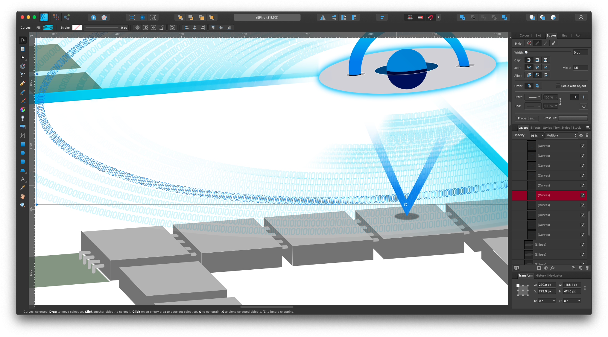
In the screenshot above, one of the trail tracks is selected, this go all around from the center all the way out, multiple conical gradients are applied to make the illusion of movement. In my head, this would be deadly-fast, binary gusts but circling around but the crosshair would turn very very slow because it’s so massive. That makes sense, right? No? Just me?
Ohgawd, I think I’m my imaginary dumbass friend.
I wanted to spell out the word rEFInd in little chiplets. It is not possible in a square artboard without making it too small so I made it look like pieces that falling in place, au Tetris, given there’s a fucking hurricane in the scene, it isn’t much of a hard sell. Then I wouldn’t have to spell it, because subconsciously people would naturally do it.
Side note: I’ve noticed I’m sort of good composing lyrics and rhymes and prose (plus spoken languages in general) I’ve only done it as some form of a joke, but maybe it’s related, I’m badly dyslexic, ADHD, OCPD… I was going somewhere with this.
I made a square design to fit in an icon space, but maybe you might remember my design is not in color, there’s only so much you can do in grayscale, when you designe in color, I learned, that detail-related restriction is not only lifted but it kind of turns into a requirement. Those trails for instance, are only in the color version. Additionally I wanted to give back to the author of rEFInd something he could use if he likes my amateurish designs, that is, so I made a wider, more standard, banner-style logo. I had space to fill so I rearranged the falling chips to spell the word without mind tricks, I committed to a falling shit so I still had to incorporate it. In the color version, which again was its own and fourth design, I sort of like motherboard pieces in layers, becoming like a lithographic Tetris-inspired assembly line boot manager. I’m not pleased with the color though, old motherboards were mostly very dark muted green, in my experience, but I’ve seen very shiny ones and recently in much more lighter green. Well, the server ones. Workstation motherboards I believe they’re all black now.
I’m hoping to get nerve to contact the author to tell him about my work and since he’s the only person that could potentially have some use for it, ask him for feedback on the color. Fix it, deliver it, and I can get back to the theme I was supposed to be working on.
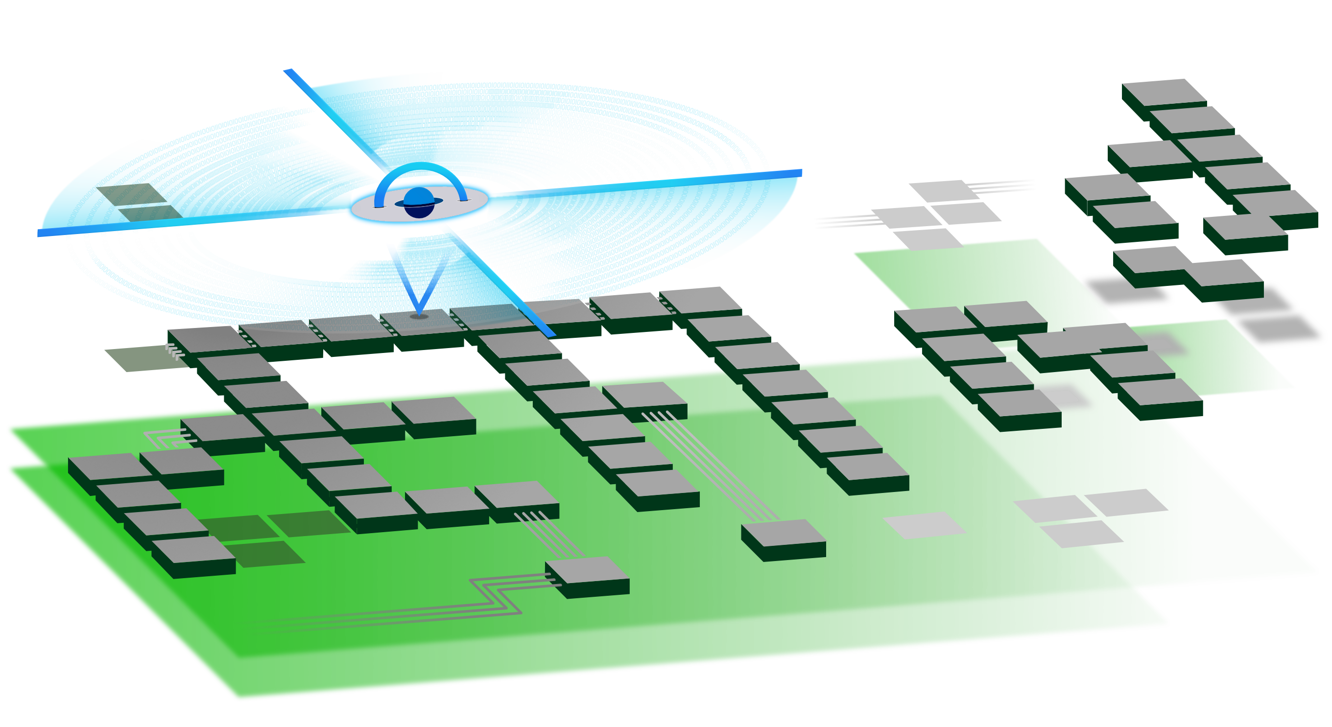
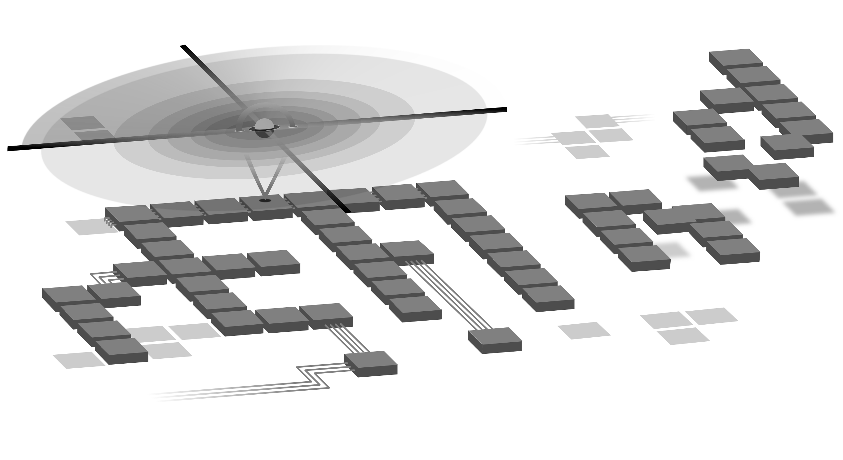

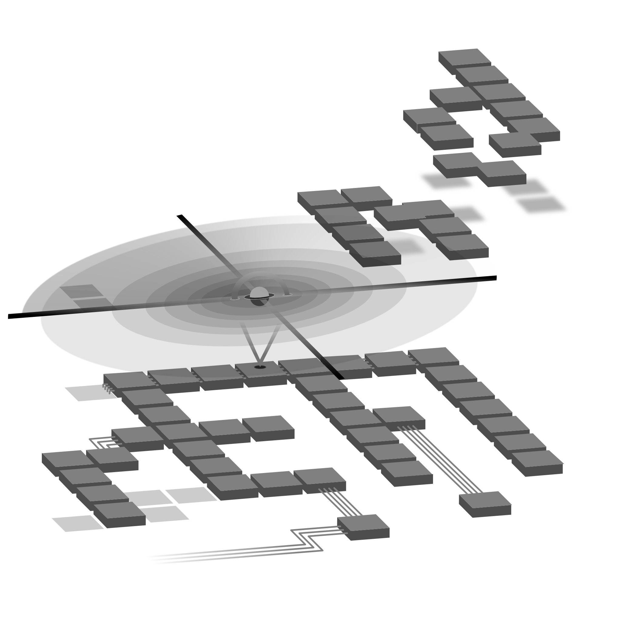
Here’s the SVG images, compressed along with the PNGs here above and with @2x “retina” sizes that I forgot to disable in the export setting. In the end I left them go in the compressed file because… because. There’s no need to retina anything, resolution was set at 400dpi before the first artboard was even created.
Here’s the zip: https://fetch.vitanetworks.link/intranet/static/embed/senseivita.com/fileserving/refind-logo.zip (15.9MB) — That’s my parent domain, no trackers, wait-to-click, email input… none of that crap. Opens in a new tab/window so you’re not left with a blank page.
I’m still doing small tweaks here and the on the original Serif Affinity Designer file, so I didn’t add it just yet but I can just add it later to the same zip later.
If you’re interested in the file, maybe contributing to it, I’d be happy to send it to you, if you happen to be Mr. Roderick Smith, I’d be honored to send them as they are/they’ll be. Though, I’d really like to deliver something a little more tailored to your taste so feel free to suggest different colors, objects to add/eliminate/move. I’ll send you the current files, then the corrected set. It’d really mean a lot, or just don’t, SVGs are basically copies. If I run into them on some website that’s all the validation I’ll need. Wow–that came out depressing, it’s not though, I’m pumped up.
Either Mr. Smith, or another(the makes it sound like I am one) a graphic designer, just contact me—I can’t leave my details around because this thing runs on WordPress and y’know…I’m sure you’ll find it though.
