UPDATE@20240513M
WordPress 6.5-ish introduced a user-friendly font management UI. There is no longer need to mess with code or to submit to the bad grammar on this post. The latest WordPress also comes with the theme Twenty Twenty-Four as the default which is a little… trying. It is not, however, required to use the font management UI as Twenty Twenty-Three before it was to use Gutenberg.
As always, I recommend you to stay clear of any plugins, including Automattic/WordPress’ own. WordPress has a pretty strong foundation by itself to create just about anything, you just need a lot of patience.
If you want for visitors to have the ability to comment, use WordPress’ built-in commenting system, don’t inject third party (that connects to other domains from your site) code into your site, it’s disrespectful to your visitors; they’re visiting your site, not Disquss or Facebook or what have you. To avoid being compromised and drive off spammers, simply don’t show the comments, you’ll still receive them. Or alternatively give visitors an email address or IM URI. If you feel the need to show comments is paramount, you’re doing it for all the wrong reasons, I believe. And JSYK: SEO is not a good reason for anything.
WordPress 6 with Twenty Twenty-Three and a more mature Gutenberg (I believe renamed the “Visual Builder”, I’m not sure though) can finally create proper free form pages.
I saw the potential immediately I just I had to figure out a few things in the process. The most pressing of them were the fonts, being brand new Twenty Twenty-Three has not much written about it unless you’re a dev and you’re willing to go down to that level.
All guide sites about WordPress, seem to copy each other’s bad advice just to put out something constantly and drive those SEOs up, like all predatory web designers do. They’re quick to refer you to a plugin that would need an API thus specifically identifying you for fuck knows what and every article on the simplest things is a drawn out web hosting tutorial before it gets to the one liner related to its title.
Following guides for previous versions of WordPress and for Twenty Twenty-Two and MDN (Mozilla’s Dev site) I figured out how to do it on my own.
So here we go.
Do your creative homework
If you’re familiar making wireframes and font choices, skip this. It’s meant as newbie-to-newbie advice.
Instead of that lorem ipsum shit, find an article or old homework of yours. Something that actually makes sense and style it in a word processor to verify that the font you want to upload looks good before doing all the work.
This seems so obvious, but it’s for that very same reason you should make sure not to skip it; once you have your demo ready, select everything (titles and body and whatnot) and increase/decrease the font size together at once, on almost all apps either size or zoom with ⌘+ and ⌘- and since the command is sort of generic, it will work on everything without messing with individual styles (plus, you can always ⌘z).
Test in low DPI displays, like that 1024×768 17″ display you have gathering dust in that room nobody lives in, now you have an excuse to clean it and of course on cutting edge high DPI displays, if you don’t know where to get one of these, don’t worry, there’s one in your pocket; most smartphones are made with ridiculously high resolution displays, just put it a little farther away than you would normally do, it does not have to be perfect.
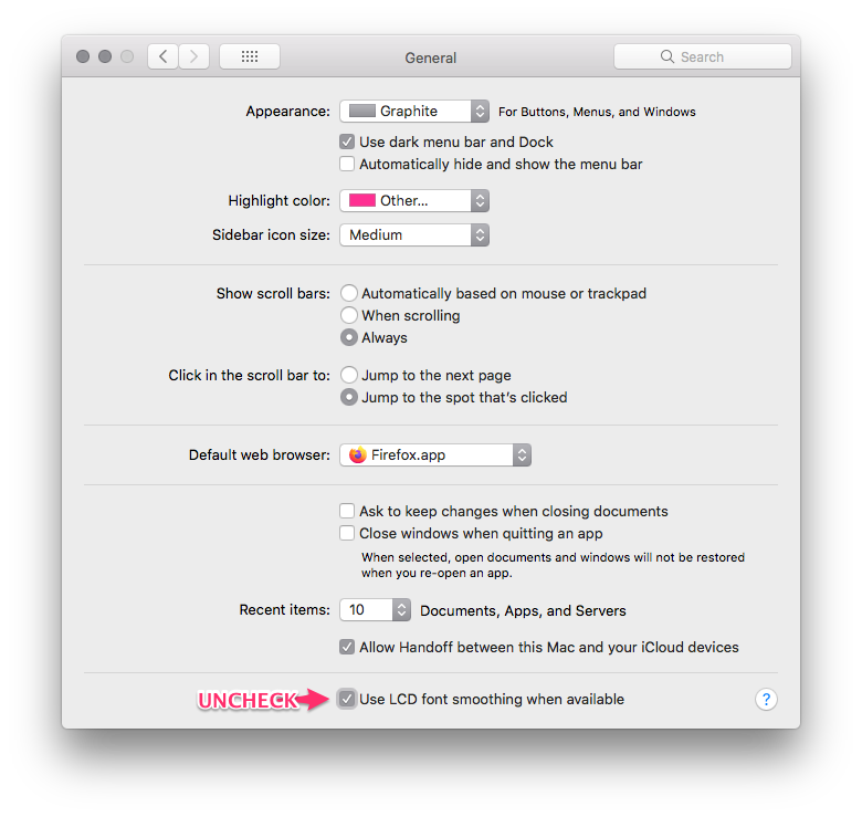
And finally, disable antialiasing:
ON macOS
Click on ⌃fnF2 spacebar ↓ ↓ ⇥ ⇥ ⇥ ⇥ ⇥ ⇥ ⇥ ⇥ ⇥ ⇥ ⇥ ⇥ ⇥ ⇥ spacebar ⌘q. Just kidding, sort of (it works).
Summon Spotlight (⌘spacebar) start typing “general” (in System Preferences) look for the item with the wall switch icon. Once it loads, uncheck the last checkbox “Use LCD font smoothing when available”.
2023-07-14 UPDATE
Font smoothing continues available in Mojave
Step 2: get the files
While I hate to refer you to an online tool, I have to because I don’t know how to do the first part without it. Grab the font you want to use and use transfonter.org🆕↗️ to export it. WordPress seems to use a WOFF2 format only — again, I am no “coder”, I did this completely on empirical analysis. Even if you already have the WOFF2 format, export it again. What we’re actually after is the extra files that come with your export: the file with the styles and a demo page file. Here’s an example. (I may or may not have had my fun with that file, if you’re easily offended 1. WTF are you doing on this site and 2. be warned)
Got it, great. Moving on.
Step number next: Identify your fonts properties, specifically, the weight
Take a look at the font’s weight value. The number goes from 100 to 900, sometimes 950. It is related to the style variation of the font. For instance, my font there (link above) is a 900, which means it’s a Black-style font.
I’m in no way using the proper names for any of this, except maybe on the things I just learned. I figured staying stupid might be for the better since I could potentially relay things better using non-technical terms. I’m a dumbass for you, I mean; if that ain’t romantic… hashtag pantydropper {said out loud}
You would think Bold, is the thickest style of a font there is —I did— but it is actually Black, or in extreme cases Extra Black (the 950 weight). Here’s a table from MDN:
| Weight | Common Name (meaning: it doesn’t have to be) |
|---|---|
| 100 | Thin, Hairline |
| 200 | Extra Light, Ultra Light |
| 300 | Light |
| 400 | Normal, Regular |
| 500 | Medium |
| 700 | Bold |
| 800 | Extra Bold, Ultra Bold |
| 900 | Black, Heavy |
| 950 | Extra Black, Ultra Black |
UPDATE
After publishing publishing the article this section was later clarified. You may skip to the next title if you’re not in the mood for nonsense.
But since this site is just fancy nonsense, I’m obliged to ask: Grrl. Are you lost? Do you know your name? How many years have been since The Fierce Massacre when our ruler dictatorness supreme Beyoncé ascended to power? Do you know the name of the lab your parents ordered you from?
Then you have to know about this thing on the web that I don’t even know what its name is, but perhaps it’s for the better so if we speak on the same misinformed terms, then we’d be able to get the same misaligned point, aligned, makes sense? Probably not. The point is, designers in the code can target a certain desired look they wish for the end result and achieve it even if they don’t provide the fonts, or if your adblocker blocks CDNs (like it should) so fonts can’t be gotten from the end user. They do this by specifying a laundry list of similar popular fonts that may already exist on your system. For example, and it is the only example I know because I was interested in a variation of one of these fonts a while back; the Arial font is a well-recognized font that you can find everywhere right?
Well, not true. This came as a shocker to me too. Arial is a licensed font, so a very similar metrically matching open source font has been developed to replace it, Liberation Sans.
The one I liked was Liberation Serif Italic, BTW, the only Serif font for which for the first time I wish I wrote meaningful enough shit to warrant me using it, plus y’know… you can’t just use italic fonts everywhere, you lose an emphasizing style and underlining is, from what I gather, not used anymore.
Back to the code, a list of font families is specified and according to those the client system renders the page the closest to what was intended.
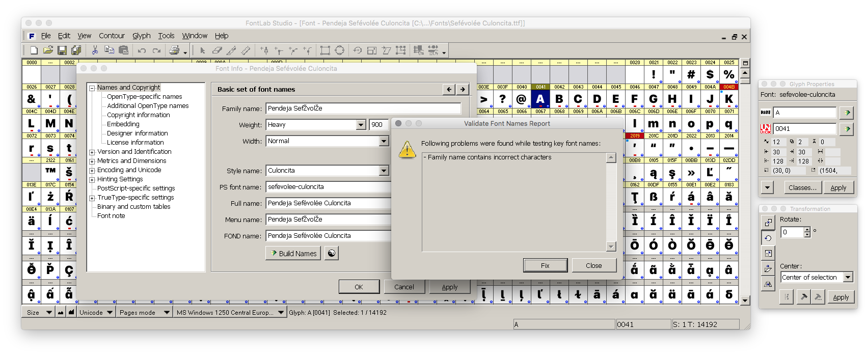
Now, remember about the styles thing? Well, when a font lets you choose from a range of styles, it is not actually one font but rather a collection of similarly based fonts. The naming structure gets more confusing and complex as a single fonts can contain both binary and compiled elements in it simultaneously, what elements? I don’t know. But there’s Postscript involved, which I think is some kind of ancient printer code that may of may not be used in SVG files as well. The part of the font with it needs its own name It needs its own name. Checkout this screenshot from this ancient font design app:
So if I wanted a site to show print in Arial Black (AKA Arial in 900), not regular, not condensed nor rounded, not bold, etc. I specify a sans serif, remember sans is French for without. Then if I happen to have a visitor using Fedora, an Linux distribution known to actively refuse adding proprietary licensed anything to the system (and probably my favorite Linux distro), then it goes, “well, Arial isn’t available, but I have Liberation Sans in a close enough weight”.
I did mention the Arial/Liberation was the only example I knew. I didn’t mention I knew it well.
UPDATE
Though, I came clean about knowing shit from the beginning, just this once I didn’t feel like potentially spreading misinformation. I’ve seen how that may lead to imbeciles in the most powerful nations on earth to actually believe shit from a sore loser wannabe dictator. I did a little (still not much) research:
1, 2, step ♫: quick review of Collections and Families: What they actually mean
To make this not so confusing I’m going to color code type design terms are in magenta and CSS terms are in this weird color (0x5d00ff).
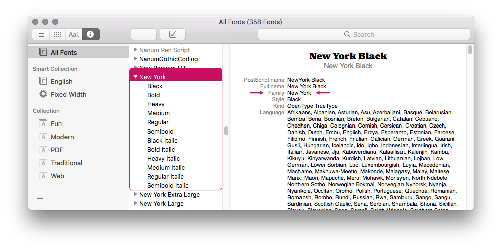
Multiple styles of the same font may form a collection. This is a TrueType term but it applies to non-TrueType fonts as well. Below is an example of the dropdown shown when an app show all styles of a font under a single name. The font in the picture is New York, a standard macOS font:
This could be just several individual fonts recognized with the same base name and different weight or slant (italics) by your app or could be the same thing in a single file, in the case of TrueType fonts. When a font is available in different styles i.e. it has various collections such as sans-serif, serif, monospaced… then it becomes a font family. Liberation is again a great example, as it comes in all of those styles just mentioned.
Just for the sake of completeness, the italics form of a font, is a style, not a weight, thus by these definitions, I think, it’s a separate collection of a font family (that would mean the drop down above isn’t showing a single collection but actually two, therefore: a family), but I couldn’t find a non-ambiguous answer to this or or one that wouldn’t contradict itself later in the article or whatever it was.
In summation:
- A font is a set of glyphs in a given weight and style
- A font collection are several fonts in the same style with different weights, they might come in a single file or split in several
- A font family are several related font collections
So that’s that. Then comes this thing that web designer do in code to allow them to target certain second-best look when the ideal outcome fails. They do this by specifying multiple very generic/popular, very similar fonts that may already exist on your system, these are called font families and it actually refers to a CSS property name.
In CSS, a font family is sort of the opposite meaning use in type design. Remember, in type design a font family are different styles of a font, sort of like a brand, whereas CSS font family refers to super generic fonts so similar that they’re interchangeable with each other without being too noticeable, ideally, not noticeable at all. It’s more akin to a font collection, which makes it unsurprising that you can enter font collection names in the font family property.
“What does it have to do with WordPress?“
Honestly, I’d hope nothing. But WordPress appears to use fontFamily as a mashup of both families and collections.
In the drop down you get using the editor, selecting a font name zeroes in on in some type of super collection, further refined by the following drop down that lets you choose among weights and style combinations (regular, bold, italic, bold italic…), these correlate to the files that come with Twenty Twenty-Three, but it also provides an alternative if they can’t be delivered to the client (the browser).
With this information you can know make educated guesses of how to add new fonts in the WordPress’ Twenty Twenty-Three code. You’ll also need to be able to read a little CSS and JSON. You don’t have to know what it means, only to identify where things begin and end. You’ll see what I mean next.
Step 5: get some tools
(You should have them already as part of deploying WordPress, so pretty much a non-step.)
This files can be edited directly on WordPress: don’t.
Get an IDE if you don’t have one already
If you don’t know what this is; it’s just a glorified basic (plain) text editor (it’s not a word processor) that recognizes multiple computer languages and applies color according to each language’s syntax. They do other programmy things as well but we’re just interested in the colors right now. Syntax highlighting (the name of it) aids devs reading thought endless lines of code without losing their sanity. Here are some examples on AlternativeTo🆕↗️.
Get a file transfer client/manager
Only if you don’t have network-based filesystem access to your WordPress installation.
Sure, you can always use file transfer protocols e.g. rsync your files edit them and push them back and forth, or even FTP them natively assisted by your OS but, unlike network-based filesystem protocols (WebDAVS/NFS/SMB/SSHFS) which don’t require first transferring the file* to edit them (i.e. they can be edited in place). A decent file transfer manager simulates this when it uses non-filesystem protocols by downloading a copy and watching it while it remains open syncing immediately back the changes you make. You just need to set the editor you’d like to open them with in the app’s preferences and instead of transferring the remote file, you select the edit option.
*: technically they do, at least part of it, but it’s transparent to the user
Doing this let’s you bypass making backups and all that, even after you save the file (depends on the editor you’re using) you just have to ⌘z or ⌃z a few times and save again. As long as you keep the file open, you can keep undoing. If the connection with the server were to break, you can simply Save As… the file locally (or copy all contents ⌘a ⌘c / ⌃a ⌃c ) and then push (or paste ⌘a ⌘v / ⌃a ⌃v) it back.
ForkLift and Cyberduck are popular options. If you’re using a Mac, avoid Transmit, it’s overhyped and too expensive. Avoid subscriptions, they don’t provide service and updates are not valid reason to get one, if anything they serve as means to control remotely your software.
FileZilla, though it works, it asks you every time you save and switch back to it if you want to upload your changes; it gets very annoying very fast. And to be clear most of these apps don’t wait for you to switch back to them, they sync immediately no questions asked; only seen FileZilla behave like this.
Step 5 again: resource transfer
Drop your font files here:

Next-quesigue: light theme hacking
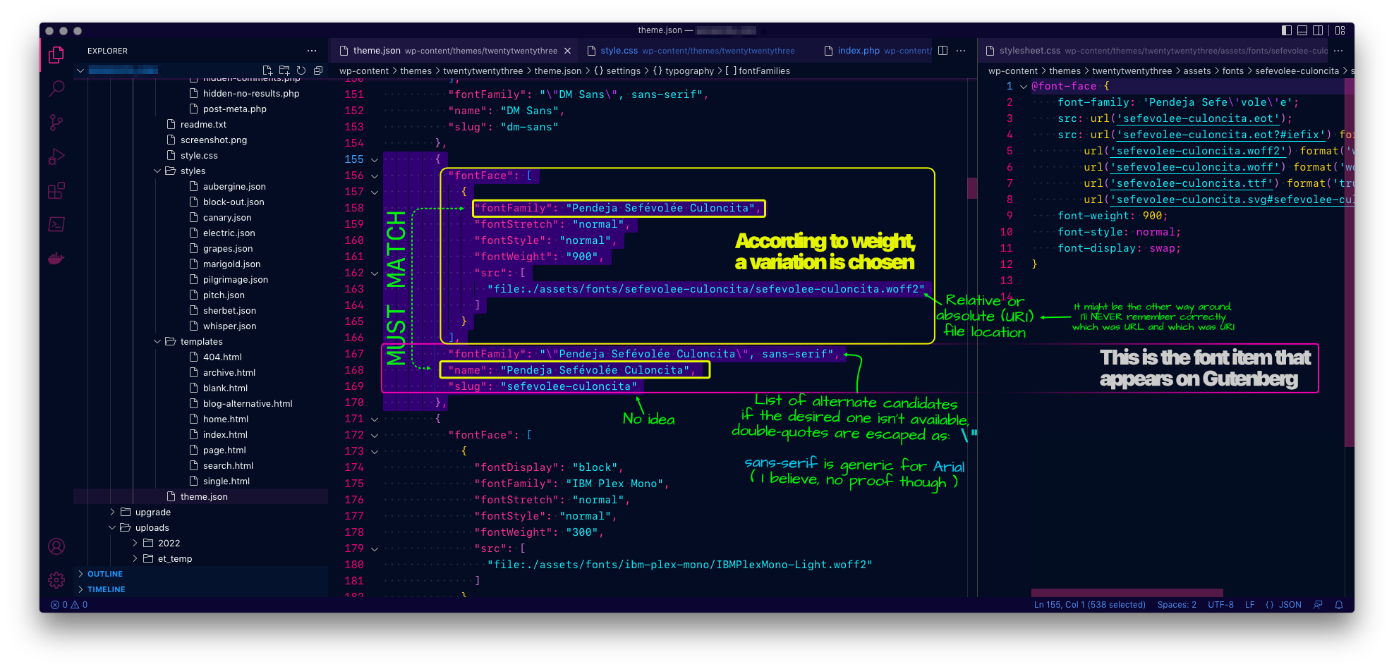
Then edit the theme.json file located here:

- Scroll down the file until you start identifying font names, then stop, and
- Depending on your IDE whenever you put the cursor in an open
{or[or(your IDE will highlight the matching closing character. - You need to choose the widest-encompassing set of characters around a font family and leave the cursor in the line after the selection so the new line is copied as well, this must be from in-between fonts, not one from the end or not one from the beginning.
- Then copy and paste it twice, the first paste will only overwrite the selection with the same thing, so it will look like nothing happened except that nothing will be selected anymore.
- Then the second (and consecutive) paste(s) will duplicate (and expand) the former selection.
- Leave a new blank line before and after the duplicated content as a guide so you don’t forget where you’re supposed to be working. You can leave them during testing as JSON ignores new lines, you’ll remove them at the end. However JSON is pretty particular over commas, and being meant for machine-to-machine code, if the code is not perfect it won’t work.
Here’s how it looks:

theme.json.Above, to duplicate that selection, I’d have to copy from line 155 to the first position of line 171. Unfortunately the cursor doesn’t show but it is on line 171. The reason of avoiding choosing from the beginning or the end, is that it is easier to make selections because you have more repetitions to learn from.
From observation, it can be seen that the keys that define a fontFace (think of “typeface” which would be the individual element of a collection, or fontFamily) are encompassed in {…} and unless it’s the last one, it is followed by a comma: {…},. JSON is a key-value language, all keys and values go double-quoted ("), it appears, maybe single-quoted ('), I don’t need to find out.
After the keys, a colon (:) follows, I’m not sure if white space is optional or not, if it’s asymmetric or not, the quotes seem to indicate it’s all optional, again, I don’t need to find out just know, I just want my fonts working. Probably you feel the same. The things grouped in square brackets, ([…]) seem to be some type of array because they aren’t paired, for instance, above reads (annotated character pairs):
{                                   ← 1A
  "fontFace": [                     ← 2A
    {…}                             ← 3A,3B
  ]                                 ← 2B
}                                   ← 1B
In other words, it’s a single {…} from [‘s and ]‘s perspective without a pair. If I’m correct I might be closer to specifying the rest of the font file types the font was exported in. The fact that I don’t know what is the syntax is the reason I said earlier WordPress only seems to take WOFF2 files. Normally you specify several for browser compatibility.
Here’s the same screenshot defaced:
Almost there.
Last step: design
The last step isn’t to “call” or “invoke” the theme in code like previous guides suggest. (Thankfully.)
You just need to modify your template parts or the template if it doesn’t have any parts to use the new typography.

And that’s about it. Good luck!
Leave a Reply