If you’ve followed this site over the years,
except not years but more like a week…
except not like for real since I’m still testing things, anyhoo, where was I? If you follow…blah blah…years, oh yeah, back on track.
I wrote earlier I’m designing a them for rEFInd, both the theme and the article about the theme are unfinished yet somehow public, today my absurdly disconnected train of thought lead me to a Wikipedia page about a Cisco OS, which in turn reminded me about creating icons for pfSense, OPNsense and Mikrotik CHR, three firewall/routers I use heavily, simultaneously too, and in one of these pages at the bottom in the semantic articles thingy I saw IPFire.
Might as well, I thought, so I clicked the link expecting to get an SVG from its Wikipedia page that I could modify, or base-on, or get-inspired-by to use in my theme. That had been my MO since I did the deceivingly simple CentOS logo from scratch only to discover the SVGs were on Wikipedia. Not this time, this is the image reference in the article:
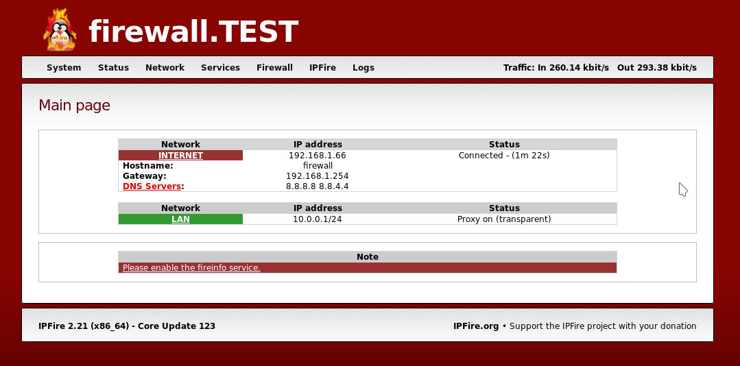
I was already distracted (and by the way: I’m only realizing it now), so I went to the site looking for a press kit or something like that. Companies always have something along the lines. Nothing.
I even went to the user forums straight to the non-help section to see if I found some fan fiction or whatever the F it’s called. Nothing.
So I got to work.
I didn’t want the fucking penguin. Penguins, the birds are adorable, but no drawing of them has ever been able to convey that, if anything I think it’s like… um… you know about chroma subsampling or ray tracing? Me neither. But there is people who do, yet oftentimes these are the same that think orange is an OK color. Wait… I just thought about a better example: Ubuntu, more appropriately blind brand loyalty. Have you noticed a lot of software GUIs are orange? Now, this is only speculation of mine, but I think it comes from Ubuntu, a free Linux distribution that at a point was the most popular in the world, it still is popular, I think this site is hosted on Ubuntu, I don’t remember. People when they get offered a “free” product or regard something as influential (because it was at some point) tend to go all in; more examples of this are: Google’s Material Design everywhere beyond the Android screen, or iOS-themed Android themes, or on the flipside the Windows look and, ehm.. “feel” on Linux desktop environments, the Louis Vuitton or Coach patterns on men’s clothing/accessories…
I tried IPFire many, MANY years back, back then it had this rather refreshing take on firewalls in color zones, as far as I remember. Which is what you see see on Cockpit if you’re using Fedora or Red Hat Enterprise Linux with firewalld enabled. To this day I haven’t see other firewall distribution that has taken advantage of it.
I only used IPFire for a few minutes, it just wasn’t featured enough and though it was very user-friendly, the color zones template system was only going to get in the way. It wasn’t the fit for me, but now that’s in my head again I can’t finish the list of people to whom I could recommend it since they’d actually benefit from it as it was all those years ago. I have a feeling it’s evolved since then, I won’t try to find out because my network if sort of OK right now and I’ve a million things to finish.
2023-07-12 Update
I’ve found a few firewalls that use zones since then. I have also actually tried finishing a working firewall using IPFire too and sadly I discovered the zones thing is actually pretty restrictive in terms of how can you set it up and works against you rather than for you. Other platforms with zones make them optional but IPFire seems to mandate them with p reestablished operation modes with only 1 out of 4 being best practice but even so in order to use the good one you’re forced to use the ones dictated for you in your main interfaces (WAN, main LAN) which, by the way, require a physical interface each without the option to put a . and sort it out later. Sadly, the shortsightedness made it impossible for me to use or recommend IPFire. It’s a shame though, it has a lot potential, were it not be arbitrarily restricted.
Anyway, long story longer, I put “IPFire” on the artboard, and stared at it for a good 10 minutes. I already went into a rant why I’m not using a penguin, plus, live birds engulfed in fire is a little too murdery for me. Then there’s the fire itself which is not only difficult to draw, it’s also messy and it’s already spelled in the name. So it’s kind of redundant.
I thought about bricks, like my own Routelogic logo, here flat:




I kinda really like that, and I’m not just designing things for a stupid theme, if the things I do can serve others, I’m happy to let go of them so they do their best. Right?
Routelogic though, I like, plus of all the things involved setting up network infrastructure, coming up with names memorable and understandable in several languages is the hardest. I’m not quite ready to let go of it and IPFire deserves its own thing anyway.
Heads up
About three days have passed since I started writing the first draft of this. I even made another design (for DokuWiki) in the meantime; I may have forgotten what I wrote and I ain’t going back.
I kinda recycled something, to be honest. But it was something I drew from scratch to mean generic Linux, a more contemporary tux in profile, I was avoiding the penguin when I drew that too.
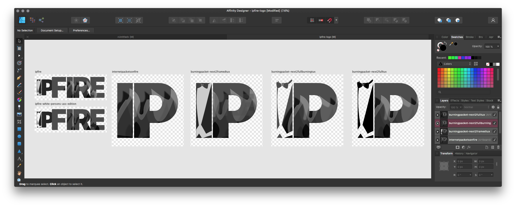
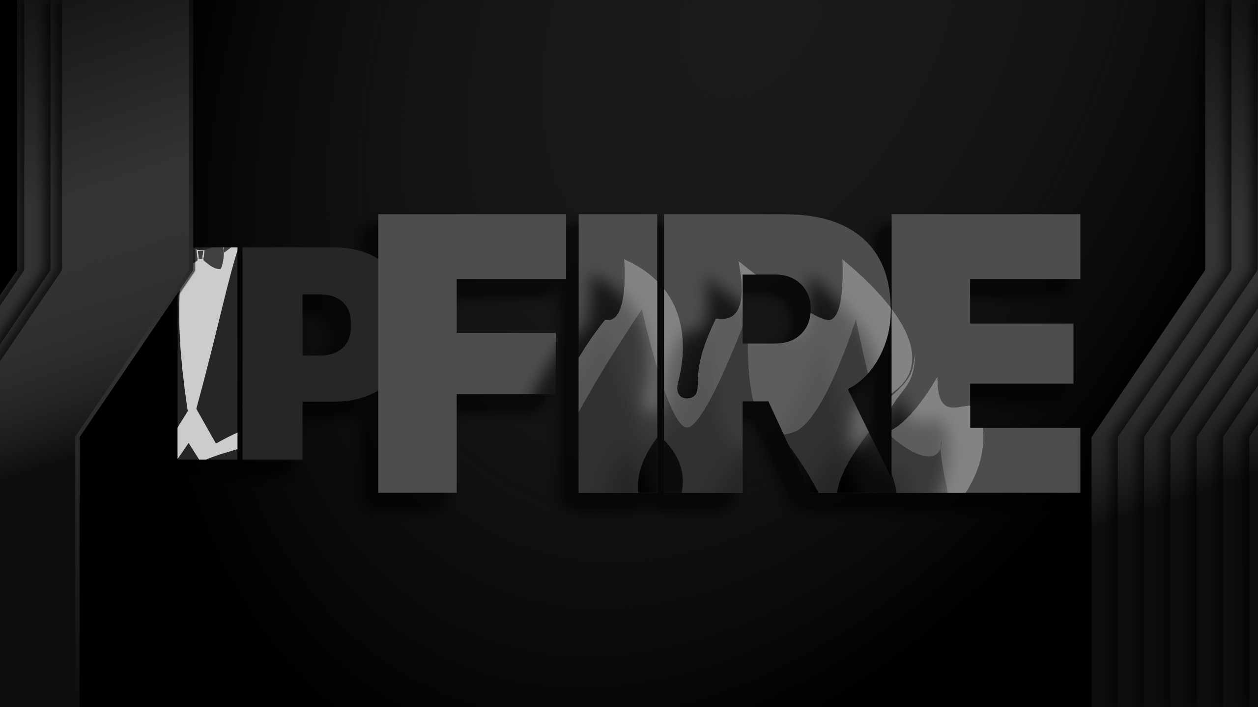
If they had a penguin burning alive, it must’ve meant they were really keen about the flames, so I found a way to add them back (☑︎) and even using them to avoid spelling FIRE (☑︎) by containing them in the letters themselves, the colors are several grayscale gradients with blending effects and I inverted the heat map (the hotter part at the core of the fire should be a lighter color, but it just looked better the other way around and because of the blending it would need too many layers doing it like that.
Organic Ads
I actually researched this → While I’ve been wearing black tie forever, I like it so I never really gave it much thought. The jacket with the coattails is actually worn in white tie jackets — more formal than black tie — the jacket is still black (or white). The tux used to be the white tie jacket in the ’50s, give or take, but since then the tux evolved to the less formal black tie jacket/suit. It no longer has coattails.
Just kidding!: The Tux
And you probably already know about Tuxedo, NY. Or at least I think it was NY, I might need to check that.
Header/banner/HERO style


ICON (SQ) style




Getting it
This should probably be a good moment that, in addition to allowing hotlinking, server logs last until shutdown and I’m not tracking what you do while you visit or after you visit, just FYI. Sidenote: If you see a little number on top of uBlock Origin little shield icon, please let me know at v at antipostal.com or mail at senseivita.com
I exported PNGs and SVGs of the original. The original, an AFDESIGN file is also included. I didn’t check if the SVGs were exported faithfully, sometimes they aren’t, but hopefully you have access to Affinity Designer so you don’t need them anyway.
PNGs always are exported fine, the document’s resolution is 400DPI, and all files are 3750px wide. You should be fine with the only PNGs as well. For reference, the image at the top of this page is 2560px wide.
I’m about to finish, I promise, I just need to put a couple of things together first.
| Size; MB | Filename |
|---|---|
| 0.26 | burningpacket-next2framedtux.png |
| 1.20 | burningpacket-next2framedtux.svg |
| 0.88 | burningpacket-next2framedtux@2x.png |
| 0.16 | burningpacket-next2fullburningtux.png |
| 0.94 | burningpacket-next2fullburningtux.svg |
| 0.57 | burningpacket-next2fullburningtux@2x.png |
| 0.15 | burningpacket-next2fulltux.png |
| 0.94 | burningpacket-next2fulltux.svg |
| 0.58 | burningpacket-next2fulltux@2x.png |
| 0.19 | internetpacketsonfire.png |
| 1.20 | internetpacketsonfire.svg |
| 0.67 | internetpacketsonfire@2x.png |
| 0.04 | ipfire-white-persons-ass-edition.png |
| 0.14 | ipfire-white-persons-ass-edition.svg |
| 0.10 | ipfire-white-persons-ass-edition@2x.png |
| 0.22 | ipfire.afdesign |
| 0.11 | ipfire.png |
| 0.45 | ipfire.svg |
| 7.90 | ipfire.zip |
| 0.34 | ipfire@2x.png |

Leave a Reply