Category: Creative’s Common

  • It started with this

    It started with this

    Back when I was playing with VoIP, I got a Cisco phone on MercadoLibre, an eBay-like site focusing on Spanish-speaking American countries. It thought it was too cheap so I thought nothing and just ordered it. It was used, but used enterprise gear tends to be better than cutting edge plastic-wrapped consumer stuff.

    I’d have a fucked up enterprise-class device, no manuals, and maybe even a missing cable over it’s sealed-box consumer counterpart any day. Not the point though. The point was that this specific phone was insufferable. To this day I have not been able to set it up except for once briefly hooked to a memory-hungry controller hacked virtualized server with a license soon to expire.

    Looking to make it work, I searched for a hardware controller of sorts. One of these ASA-, IOS-router things. One with a perpetual license. Without a clue of knowing what would work. Instead, when I stared at the blank search box on eBay, I just entered “cisco server”. Groundbreaking, I know.

    Among the results, nothing seemed familiar, but there was a few that caught my attention. These were for the C200 line of servers. A dual CPU 1U hypervisor.

    It looked cool, it has a lot of crevices and intakes in the front but it still looked flushed and sleek in silver tones. It looks a little like Xserve in a way. I knew that was not what I needed but fuck it, ADHD had already taken over. The VoIP craze was over, enter the hypervisor era.

    The shipping was more expensive than the server itself. I learned a lot on the thing, soon more servers followed, as did the quest for clustering and hypervisors during which at some moment I landed on Unraid.

    In the divine guidance temples Unraid is known as a figure god, y’know, like those you find on taxi cabs “for good fortune” and stuff. It’s not for that though, it’s the DIY demigod, which means a half god whose godmother is Demi Moore. You can’t make this stuff up.

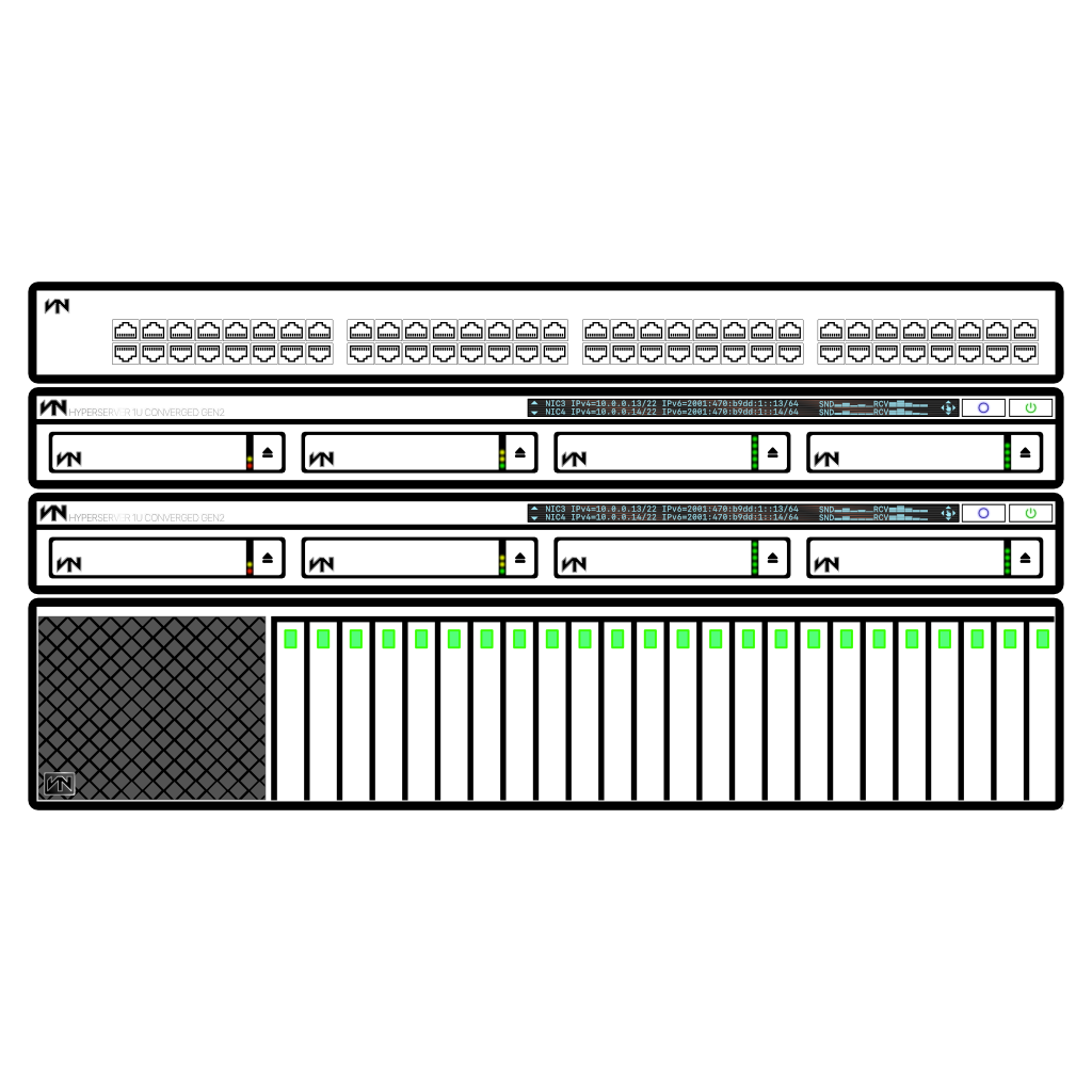
    Following the DIY spirit, they told me that I should have a picture more representative of my server for Unraid for its self-identification, a thing on Unraid. So I designed my first server drawing.

    It’s loosely-based on the C200, I wanted it to be visually simple like the rest of the icons that come with Unraid, but at the same time have some way for it to be either amazingly detailed — which is sort of the opposite of simple — or unique or both. What do you do.

    And then it hit me. Add an LCD screen. Because from afar it looks like a black line, I can get away with murder adding all sorts of things in there.

    The display itself was based on this Sony stereo system that I somehow lost. I have no idea how because you just don’t lose something that big.

    For starters, it came with two pairs of speakers and a weird amplifier thing that sit next to it that had no buttons, no nothing on it. It just connected to the main unit with a really short ribbon cable and required its own power cord. I don’t remember much anymore but, Sony systems have their LCD readings on this light blue color, almost like silvery and the LCD panel tends to have some orangy lines that cross the whole length of it. They look like heating elements, so I assume that’s what they are. I don’t know for sure, but since these devices are manufactured to be sold around the world it makes sense to keep the displays at a certain temperature so when they actually are energized it doesn’t shatter or stays unresponsive from being unable to move or whatever it happens there. Remember that LCDs twist/reorient some crystalline material in a tiny vessel so it obstructs or allows light to shine through.

    This is it:

    The display:

    You can order it with a switch and a storage server, if you want (these were among the earliest versions):
    Later I started them using them when asking for help in support forums to get some use out of them and to show like I care and I’ve done research and I’m not just asking “it broke now what?” expecting for things to be handed to me. Well, sort of, I use an existing design I usually end up modifying it beyond recognition or creating new stuff for the occasion and many times I get so in it that by the time I finish I feel as if all the time it took for me to be happy with the design I had spent writing a really long post even though I hadn’t written a thing yet and I end up scrapping a lot of things because of that. Not the designs though, just the posts.

    I didn’t know… I like designing random diagrams this much. It’s feels therapeutic. Time just stops.

    Once, on the pfSense forum, I was barked that my drawing couldn’t be read on dark backgrounds. This is when browsers started detecting OS theme on Linux. Windows and macOS were still a long time from doing that.

    I updated the designs: a white border was added on what essentially is a design that details only borders. That’s bordered borders–if you got lost. The white allows for any color to be seen in any background but since the designs themselves are only visual aids, black had to go, it’s too bold and distracts from the objective/purpose. I changed it a shade of gray that without the white contrasting border itself can be put against full black or full white backgrounds and still be seen. Clearly.

    Next followed a little perspective, shown in the first image of this post and I was only getting started.

    At that time though, those were the highest of my skills. I started struggling to align two boxes together, so I think I’ve managed to learn a little something.

    It’s so weird because I can’t draw on paper to save my life. I read or heard just in the last two days that this isn’t as weird as I think, but fuck it, to me it is super strange. What can I do. I guess the sooner I accept it it’ll stop being weird, huh? So…

    [ shutting eyes tight ]

    [ look around with one eye open ]

    No, still weird.

    So what’s this about, again?

    I just scrolled up, and realized I’ve been going on and on with no explanation or goal whatsoever. It happens.

    After those drawings I started experimenting and sometimes I’d daydream designing things. I’m a huge geek so servers, mostly, that I’d like them to exist, so I’mma put ’em out there for some big corporation to steal and hopefully make them.

    If that actually happens, I’d like to point out that this whole site is licensed CC BY-SA v4.0 International, GPLv3 if it involves code. I encourage everyone to take whatever you want from my site(s), just don’t be a dick and come suing me for it later. Not that that’s gonna work in my country where it’s not hard to find a government office with a pirated copy of Office or whatever. That’s how much we they’ll care. But, y’know, better safe, specially since other people may still become target of these abuses.

    I’m too lazy to hunt every design I’ve made, let alone export them. So I’ll keep posting updates and little batches of inspiration. After all, I’m not real designer, I can’t just design on command, I kinda have to wait for it. That’s also weird. It is, right?

    I don’t know.

    Anyway, I wish you all the head in the world—maybe I can get on that. Later. 🙂


    Do I spell check or do I not? Hmm…
  • Up for grabs: qBittorrent’s logo

    Up for grabs: qBittorrent’s logo

    I created this on a long time ago, this week I tried to do the blue one, but honestly I’m not too pleased with the results I’ve gotten so far. I got an OK result after a while but it wasn’t as easy as the other.

    Design background

    The look I was going for is these huge buttons from the ’50s opposite to today’s all plastic, super-low depth piezoelectric buttons hollow buttons, or even capacitive buttons on appliances, devices and even machinery (i.e. cars) where it makes no effing sense! Sidenote: remember ’s 3D touch and the fake home button button? Right not I’m not a fan of  but that was a good implementation of capacitance—of course, Tim Cooks’ Apple kills stuff quicker than Google kills projects, so that’s gone now.

    The buttons I’m talking about, mostly in those old huge round cars with the giant hood, they weren’t exactly buttons, they were more like levers, well… more like a rod you pushed and pulled slightly concave, their face was some sort of embossed/stamped/pressed/whatever plastic, chromed with shiny backing I think; however given the era it may have real pressed metal. IDK, that was decades before I was born, but that look is still in used in cars and appliances today: the start button in cars is a bigger, smooth and matte version of that, except without the giant rod behind it connecting it to the wheel were the donkey is chasing a carrot under the hood or whatever they did. Now behind it, there’s one or more LEDs, an NFC reader, your daily commute sent to a server in real time for bidding and/or surveillance, y’know, progress.

    In the case of the blue one; it’s obviously much darker than the original design, that was just because of that shiny finish of the material I was referring to before, colors seemed to be darker until sunlight hit them, I still went a little darker though, so it wouldn’t look cartoonish.

    Because of the shadows, the artboards will look a little off-center if you open the file in an editor but it is centered. I’ve OCPD; it has to be.

    Files’ info

    So… there was an issue exporting SVGs. It turns out the blending can be reproduced in that format, the end result was either without the effects that were the thing that took the most time to make it look good or rasterizing part of the file. I weighted the options exporting on the other open formats I had available: EPS (PostScript v3) and PDF. PDF completely lost all vector information, EPS came out exactly like SVG but glitchier.

    I’m attaching the original Affinity Designer AFDESIGN file as well, but it’s not an open format nor as popular as AI, so I exported PNG in twice the original size.

    Other specs

    Document resolution400 DPI
    Artboard dimensions2048px × 2048px
    Color formatRGB/32 (HDR)
    Color profilesRGB IEC61966-2.1 (Linear)
    Alpha channel✔︎

    The PNGs have already been compressed, the space saving was very impressive, I didn’t not expect that:

    Regular file sizeCompressed PNGFilename
    12.0000.53qbittorrent-blue-svlogo.png
    00.64qbittorrent-blue-svlogo.svg
    46.0002.20[email protected]
    11.0000.63qbittorrent-svlogo.png
    00.44qbittorrent-svlogo.svg
    42.0002.50[email protected]
    00.08qbittorrent-svlogo.afdesign
    07.10qbittorrent.zip
    Sizes in megabytes. The ZIP contains all of the above. Individually you can get them by completing the URL https://fetch.vitanetworks.link/static/embed/designmaster/qbittorrent/ with the desired filename. BTW, that’s “designmaster” as “CD master”, “main copy of…”, it isn’t a self-given title. Gawd, these italics are hideous. I need to fix it soon.

    I’m bored now, so that’s it. 🙂

  • Up for grabs: new DokuWiki logo

    Up for grabs: new DokuWiki logo

    Some time ago I posted an article about DokuWiki, I don’t remember what it was. The site was new. It’s still new, it’s perpetually new since I barely do anything to it so articles are more like placeholders to evaluate what is the look I want, I needed to some image for that post.

    I may be still finding my ways and I’m aware that I will make mistakes like a beautiful young geisha who got railed by a soccer team and broke character in the moment, that’s fine. But like the geisha, I have something very well semented cemented: I want as little color as possible other than in accents, and maybe a soccer team. So for like the fourth time this week, I created another logo.

    Logo in the hero

    UPDATE

    Since the original, the design has been updated for a third time. This post has been mostly rewritten to reflect that.

    After the first version, I bet you cannot guess what came next. You better sit down for this…

    Ready?…

    The second version! Wow!, I know, right?!

    “Can’t innovate, my ass!”

    Phil Schiller
    v2

    What are those lines inside the letters, I hear no one ask?

    DokuWiki’s original, official, logo is a little too busy for me. I has too much color yet not enough. What I mean is that it’s a faded old-librarian-looking sort of color palette, which I guess in a way is fitting for the kind of web app it is.

    But why though? There’s no need to evoke the old paper look, we do things on screens now. Recently there was an effort to save Ukraine’s digital history because of its invasion and even the big giant library, Wikipedia, got a refreshed look as well. At least in the posts of my site/intranet, I’m going to try to make DokuWiki look the best I can with my non-existent developer skills.

    Reading some article DokuWiki’s website I learned that the arrows of the original design are supposed to symbolize hyperlinks while the different-colored pencils mean collaborative editing.

    Oddly enough I arrived to the same conclusion but for completely different reasons: see, to me having different colors on the pencils is either a way to not make the design look repetitive or could be because of the formatting (styling) of an article e.g. title, headers, code boxes, links, etc. The arrows were an indication of the pencils moving, while being two of them I thought it meant simultaneous collaborative editing.

    So, yeah… kind of the same conclusion but followed a completely different path to get there.

    I decided to leave that behind. I outlined the old logo because it would be a smoother transition and out of respect for the original author, I took a little inspiration from what I’ve learned from my own progress since I started designing my own stuff, there is this handwritten logo I made before. I wouldn’t do another handwritten logo though, it’d look just lazy and sloppy, but I wanted to incorporate either handwriting or some sort of cursive or long stroke text styling. “DokuWiki” is a wide word, I like elongated, very stylized things. I gravitate heavily towards minimalist design but I don’t give a f**k if it’s not true minimalism, I’m only in it for the looks not so much the practical side of it.

    So if it can’t be slender and colorless, heroin chic, then go all the way in the opposite direction. Exacerbate the width, go for bold. And so I did.

    So, where does the handwritten comes in?

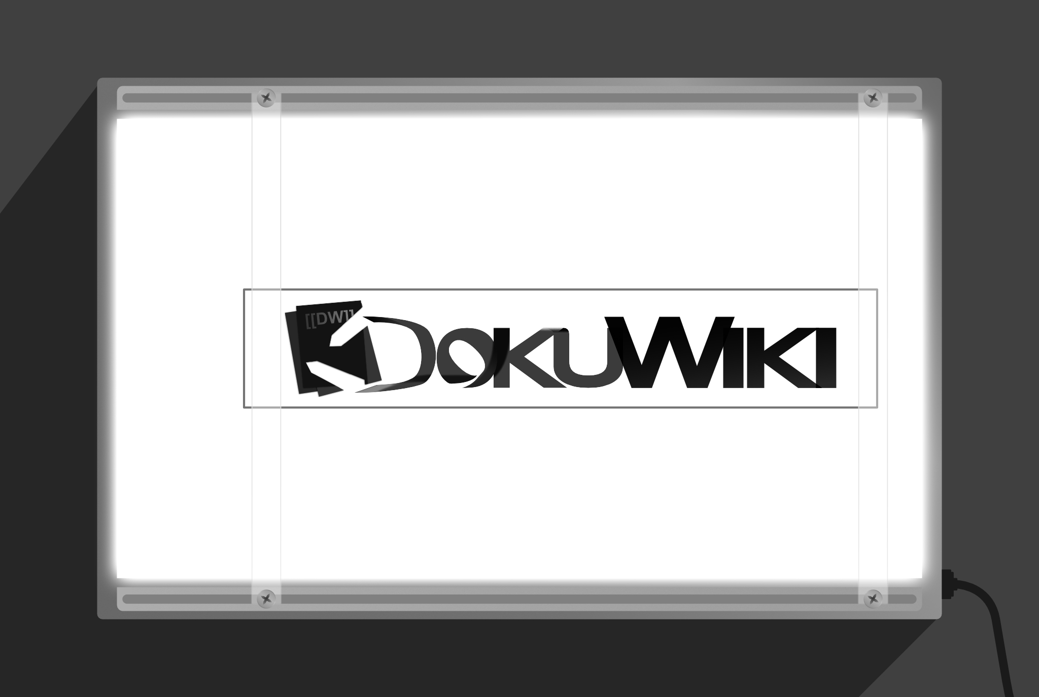
    Inside! The extra width allow to ornament the text from within so it still has a clean(-enough) silhouette. Imagine you have one of those lamps to look at x-ray film:

    Full disclo, I don’t know what the name of the device is so I could look up a picture to make an illustration of it, so this is the second thing I pulled out of my ass today. 🙂

    The design is still usable using only the its outline, e.g like for stationary or whatever, like I said, I’m not exactly big on print.

    Then why bother?

    Because somewhere I read… or heard… IDK, that logos should work in one or two colors, and because if deemed worthy, all of these logos I’ve been making for other people/brands/organizations, I intent to give the rights to them to their respective prospective owners. What good do they do just sitting there on some intranet website or single post on a single site when they can serve much better the projects’ owners? Right?

    And in the case of DokuWiki, it’s1 letting me use this awesome tool for free, it’s the least I can do to give back. It’s most likely to get ignored anyway since it1 seems to be all in in the sepia theme.

    1. DokuWiki — the organization/project

    UPDATE NÚMERO TRES

    Some day in April 2023

    So, the other day I was doing something totally very interesting — and I know because somebody told me “that’s totally very interesting what you are doing” when I told them to tell me — and I saw this (current) page and I didn’t like my design anymore, some of it.

    On the senseirum, the place where the Jedi keep the dragon balls and where the sensei (past and current) meet in telespiritference, but most importantly where the ultimate knowledge of nothing is kept and has been fiercely guarded for millennial; the sensei relayed to me the theory that the more time you spend working on something, the more likely you are of Stockholm Syndrome yourself into liking it and I think that happened to me.

    There was something off. I made a few more modifications and dialed down the effects used on the design. I replaced the most of the alpha-blending effects with their results applied directly as opaque fillings so at the time of exporting SVGs the incompatibilities were minimized. I also confident-black-womaned (or in certain markets: “dad-bodded”, “hot daddyed“) part of it to be more uniform, because part of the reason I created my own logo, was not only giving it neutral colors but also making it look a little less haphazardly put, still preserving the original author’s design a little.

    Last minute, I found out that part of the incompatibilities of SVG exports were due to the color format the design had; it had originally RGB/32 (HDR) color format, after changing it to RGB/16 now it exports OK. However, even if it didn’t, the changes are done so it should have minimal issues across different devices.

    I downsized the number of objects as well, for instance; in the previous designs, the whole image was backed by a white bottom of its own outline because otherwise the blending would darken or lighten pseudorandomly colors behind it, and therefore the image itself.

    In the end, it came up more minimalist than I expected anyway.

    Files

    In the first two versions, I exported to hi-res PNG, the original multi-artboard AFDESIGN (Serif Affinity Designer) file, SVGs, PSD, EPS, EXR and HDR. Neither SVG nor EPS exported correctly so I threw in PSD (which seems to support vector data) and HDR and EXR because they seemed fancy enough that they might be usable tor recover information to reconstruct the SVGs.

    That’s no longer necessary, so there are only SVGs and PNGs this time. There’s an simple HTML file that should be easy (enough) to edit to preview the SVG files with transparency.

    An finally the original AFDESIGN file which also includes the previous version and a fourth text-only version of the design which I didn’t mention earlier because it’s unfinished. I don’t think I can finish it because I’m teaching all the padawan Advanced Telekinesis and Introduction to the Dark Arts this millenial, and right on cue the anti-dark arts matter protesters won’t go away. Without zen in the gardens, the padawan can’t be taught, y’know how it is…

    ls

    107K dokuwiki.afdesign
     11M dokuwiki.zip
    2.9M dw-svlogo-dw-text-only-draft.png
     92K dw-svlogo-dw-text-only-draft.svg
    3.7M dw-svlogo-header-lightsout.png
    296K dw-svlogo-icon-lightsout.png
    108K dw-svlogo-icon-lightsout.svg
    370K dw-svlogo-icon.png
    148K dw-svlogo-icon.svg
    3.4M dw-svlogo-opaque-effects.png
    188K dw-svlogo-opaque-effects.svg
    664B index.html
    All the files are in the ZIP. You can get them individually by appending the filename to the URL; https://fetch.vitanetworks.link/static/embed/designmaster/dokuwiki/

    Meta

    Document resolution400 DPI
    Artboard dimensions – squared1024px × 1024px
    Artboard dimensions – banner/header-type5400px × 1024px
    Color formatRGB/32 (HDR)
    Color profilesRGB IEC61966-2.1 (Linear)
    Alpha channel✔︎
    v1, v2
    Document resolution400 DPI
    Artboard dimensions – squared1024px × 1024px
    Artboard dimensions – banner/header-type5400px × 1024px
    Color formatRGB/16
    Color profilesRGB IEC61966-2.1 (Linear)
    Alpha channel✔︎
    v3

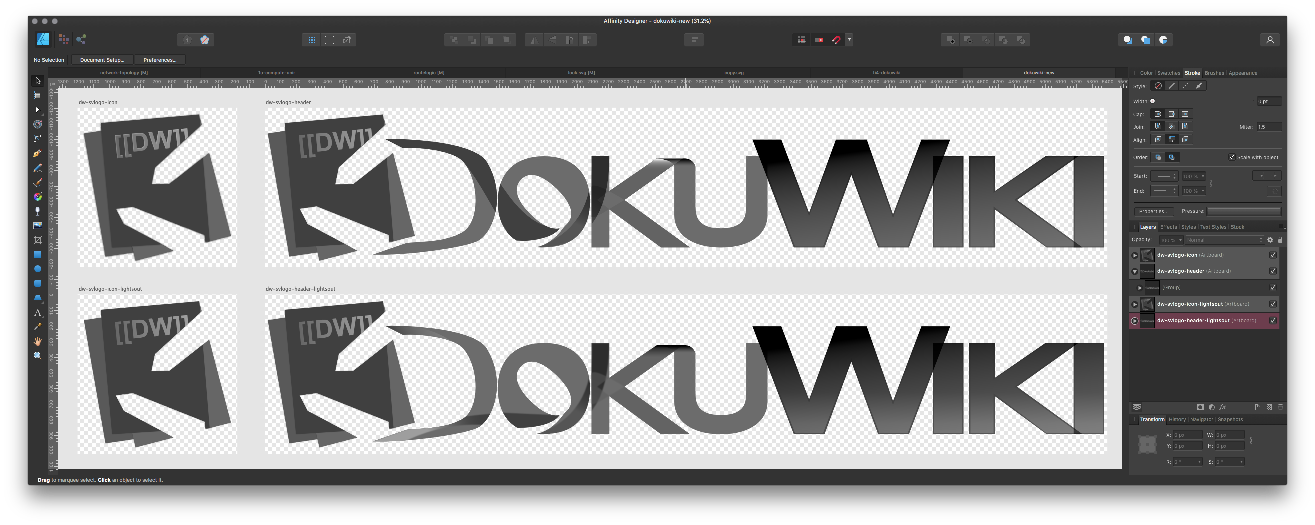
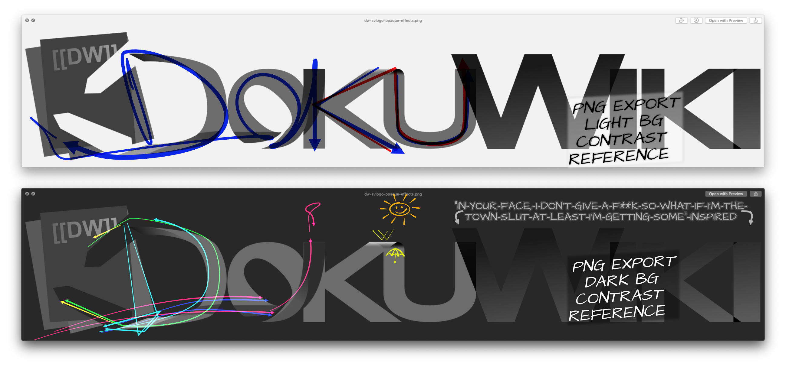
    Preview

    Below in the upper artboart, in the lower artboard is the unfinished design.

    Last time, there was long explanation spanning many paragraphs about design decisions/elements, why this and that. I’m summarizing that in a single annotated image. It does a quicker job and I think most can be inferred from it.

    Yes, it is a single image, right click it or drag it out of the browser to save and you’ll see.

    Just outside of the view, the previous design is still included as well as a fourth text-only design that I wasn’t convinced it was good enough.
    Slightly big-ass-upped, links (strokes) smoothed

    Allez ! C’est tout.

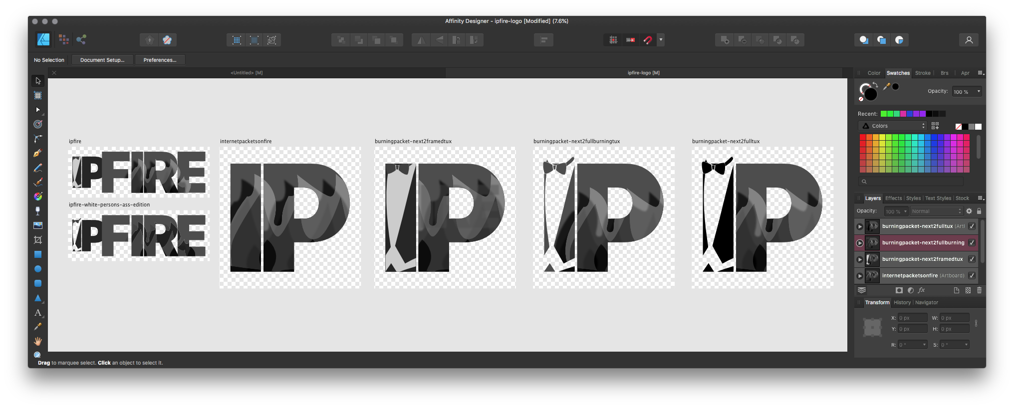
  • Up for grabs: IPFire’s logo

    Up for grabs: IPFire’s logo

    If you’ve followed this site over the years,

    except not years but more like a week…

    except not like for real since I’m still testing things, anyhoo, where was I? If you follow…blah blah…years, oh yeah, back on track.

    I wrote earlier I’m designing a them for rEFInd, both the theme and the article about the theme are unfinished yet somehow public, today my absurdly disconnected train of thought lead me to a Wikipedia page about a Cisco OS, which in turn reminded me about creating icons for pfSense, OPNsense and Mikrotik CHR, three firewall/routers I use heavily, simultaneously too, and in one of these pages at the bottom in the semantic articles thingy I saw IPFire.

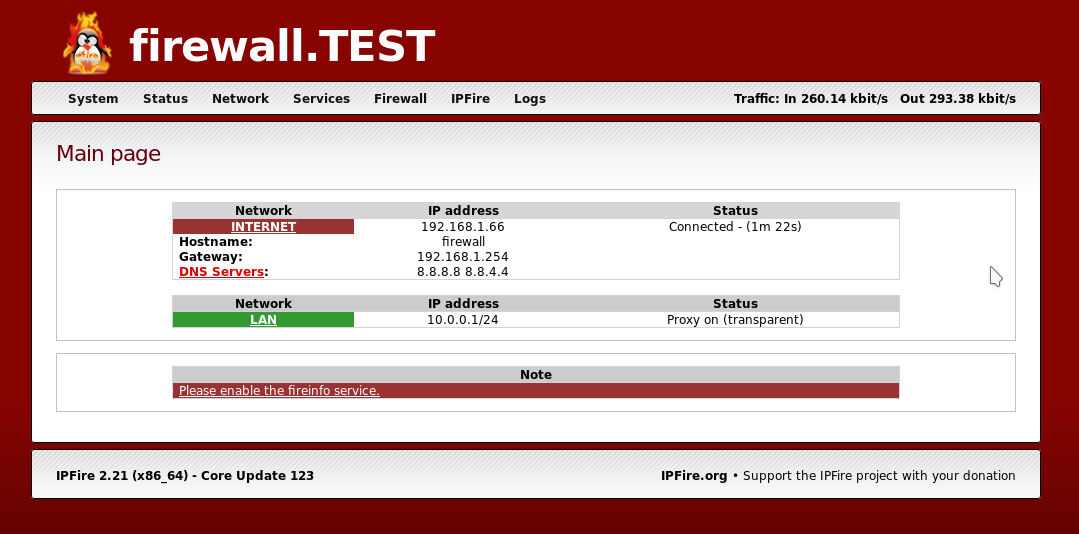
    Might as well, I thought, so I clicked the link expecting to get an SVG from its Wikipedia page that I could modify, or base-on, or get-inspired-by to use in my theme. That had been my MO since I did the deceivingly simple CentOS logo from scratch only to discover the SVGs were on Wikipedia. Not this time, this is the image reference in the article:

    I was already distracted (and by the way: I’m only realizing it now), so I went to the site looking for a press kit or something like that. Companies always have something along the lines. Nothing.

    I even went to the user forums straight to the non-help section to see if I found some fan fiction or whatever the F it’s called. Nothing.

    So I got to work.

    I didn’t want the fucking penguin. Penguins, the birds are adorable, but no drawing of them has ever been able to convey that, if anything I think it’s like… um… you know about chroma subsampling or ray tracing? Me neither. But there is people who do, yet oftentimes these are the same that think orange is an OK color. Wait… I just thought about a better example: Ubuntu, more appropriately blind brand loyalty. Have you noticed a lot of software GUIs are orange? Now, this is only speculation of mine, but I think it comes from Ubuntu, a free Linux distribution that at a point was the most popular in the world, it still is popular, I think this site is hosted on Ubuntu, I don’t remember. People when they get offered a “free” product or regard something as influential (because it was at some point) tend to go all in; more examples of this are: Google’s Material Design everywhere beyond the Android screen, or iOS-themed Android themes, or on the flipside the Windows look and, ehm.. “feel” on Linux desktop environments, the Louis Vuitton or Coach patterns on men’s clothing/accessories…

    I tried IPFire many, MANY years back, back then it had this rather refreshing take on firewalls in color zones, as far as I remember. Which is what you see see on Cockpit if you’re using Fedora or Red Hat Enterprise Linux with firewalld enabled. To this day I haven’t see other firewall distribution that has taken advantage of it.

    I only used IPFire for a few minutes, it just wasn’t featured enough and though it was very user-friendly, the color zones template system was only going to get in the way. It wasn’t the fit for me, but now that’s in my head again I can’t finish the list of people to whom I could recommend it since they’d actually benefit from it as it was all those years ago. I have a feeling it’s evolved since then, I won’t try to find out because my network if sort of OK right now and I’ve a million things to finish.

    2023-07-12 Update

    I’ve found a few firewalls that use zones since then. I have also actually tried finishing a working firewall using IPFire too and sadly I discovered the zones thing is actually pretty restrictive in terms of how can you set it up and works against you rather than for you. Other platforms with zones make them optional but IPFire seems to mandate them with p reestablished operation modes with only 1 out of 4 being best practice but even so in order to use the good one you’re forced to use the ones dictated for you in your main interfaces (WAN, main LAN) which, by the way, require a physical interface each without the option to put a . and sort it out later. Sadly, the shortsightedness made it impossible for me to use or recommend IPFire. It’s a shame though, it has a lot potential, were it not be arbitrarily restricted.

    Anyway, long story longer, I put “IPFire” on the artboard, and stared at it for a good 10 minutes. I already went into a rant why I’m not using a penguin, plus, live birds engulfed in fire is a little too murdery for me. Then there’s the fire itself which is not only difficult to draw, it’s also messy and it’s already spelled in the name. So it’s kind of redundant.

    I thought about bricks, like my own Routelogic logo, here flat:

    I kinda really like that, and I’m not just designing things for a stupid theme, if the things I do can serve others, I’m happy to let go of them so they do their best. Right?

    Routelogic though, I like, plus of all the things involved setting up network infrastructure, coming up with names memorable and understandable in several languages is the hardest. I’m not quite ready to let go of it and IPFire deserves its own thing anyway.

    Heads up

    About three days have passed since I started writing the first draft of this. I even made another design (for DokuWiki) in the meantime; I may have forgotten what I wrote and I ain’t going back.

    I kinda recycled something, to be honest. But it was something I drew from scratch to mean generic Linux, a more contemporary tux in profile, I was avoiding the penguin when I drew that too.

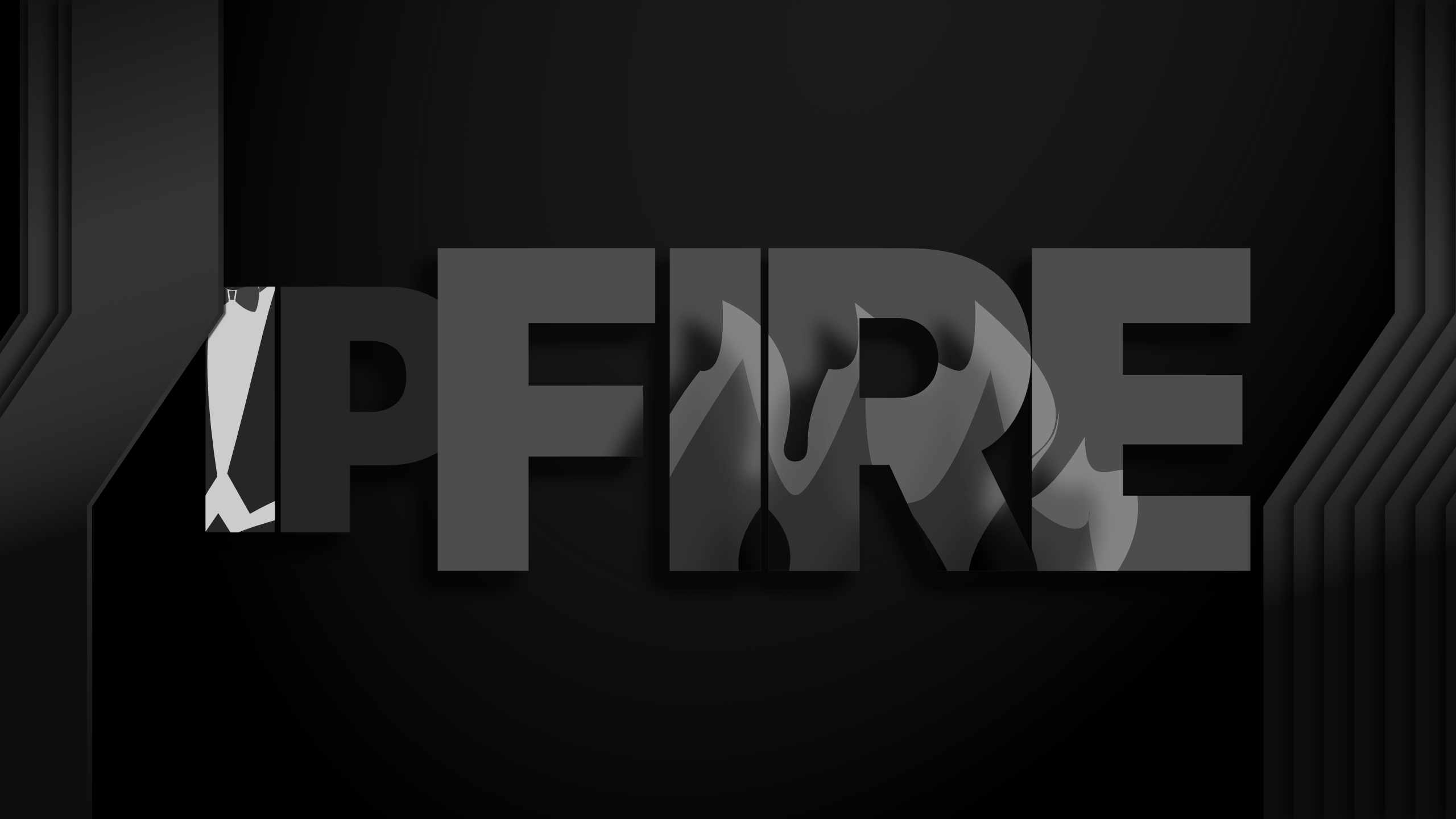
    If they had a penguin burning alive, it must’ve meant they were really keen about the flames, so I found a way to add them back (☑︎) and even using them to avoid spelling FIRE (☑︎) by containing them in the letters themselves, the colors are several grayscale gradients with blending effects and I inverted the heat map (the hotter part at the core of the fire should be a lighter color, but it just looked better the other way around and because of the blending it would need too many layers doing it like that.

    Organic Ads
    Just kidding!: The Tux

    I actually researched this → While I’ve been wearing black tie forever, I like it so I never really gave it much thought. The jacket with the coattails is actually worn in white tie jackets — more formal than black tie — the jacket is still black (or white). The tux used to be the white tie jacket in the ’50s, give or take, but since then the tux evolved to the less formal black tie jacket/suit. It no longer has coattails.
    And you probably already know about Tuxedo, NY. Or at least I think it was NY, I might need to check that.

    Header/banner/HERO style

    ICON (SQ) style

    Getting it

    This should probably be a good moment that, in addition to allowing hotlinking, server logs last until shutdown and I’m not tracking what you do while you visit or after you visit, just FYI. Sidenote: If you see a little number on top of uBlock Origin little shield icon, please let me know at v at antipostal.com or mail at senseivita.com

    I exported PNGs and SVGs of the original. The original, an AFDESIGN file is also included. I didn’t check if the SVGs were exported faithfully, sometimes they aren’t, but hopefully you have access to Affinity Designer so you don’t need them anyway.

    PNGs always are exported fine, the document’s resolution is 400DPI, and all files are 3750px wide. You should be fine with the only PNGs as well. For reference, the image at the top of this page is 2560px wide.


    I’m about to finish, I promise, I just need to put a couple of things together first.

    Size; MBFilename
    0.26burningpacket-next2framedtux.png
    1.20burningpacket-next2framedtux.svg
    0.88[email protected]
    0.16burningpacket-next2fullburningtux.png
    0.94burningpacket-next2fullburningtux.svg
    0.57[email protected]
    0.15burningpacket-next2fulltux.png
    0.94burningpacket-next2fulltux.svg
    0.58[email protected]
    0.19internetpacketsonfire.png
    1.20internetpacketsonfire.svg
    0.67[email protected]
    0.04ipfire-white-persons-ass-edition.png
    0.14ipfire-white-persons-ass-edition.svg
    0.10[email protected]
    0.22ipfire.afdesign
    0.11ipfire.png
    0.45ipfire.svg
    7.90ipfire.zip
    0.34[email protected]
    All files are included in ipfire.zip. For the individual links, complete this URL with the the desired filename in the placeholder: https://fetch.vitanetworks.link/static/embed/designmaster/ipfire/<filename>. Non-TLS access is allowed.